


Maximizing bookings: Tailored strategies in English learning space
I had a great opportunity to plan and implement the whole design process and build a functional platform to book English lessons online.
Online English Teacher – Learn American English Online
Problem
Most potential students-visitors are usually upper-middle-class professionals who want to improve their English for life and work and improve it as a lifestyle, not just for a trip or test.
Objective
We need to inspire students to keep taking classes for more extended periods, which is nice to build a relationship.
Idea
Personal stories are very emotional and work well. We tell them how some students achieved success. We share personal information about the teacher. We post all the video tips on how to have an American English accent and improve English pronunciation.
What I did:
- Setting goals and objectives
- Stakeholder interviews
- Site audit
- Product positioning
- Building personas
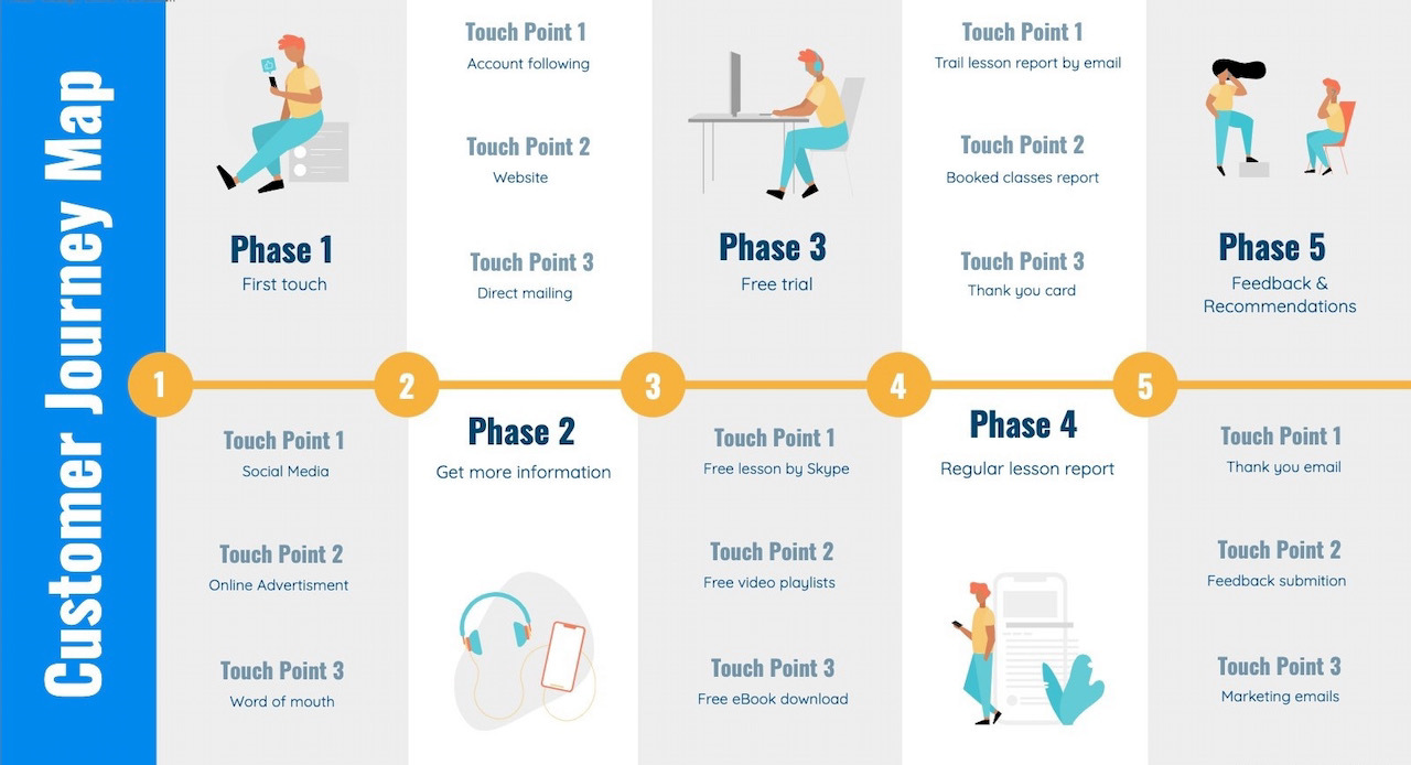
- Creating user journeys and stories
- Creating site maps
- Content audit and Content strategy
- Conducting competitive research
- Creating wireframes
- High fidelity prototypes
- Usability testing
- Measuring and Iteration
- Graphic design
- Site launch
- Post-launch testing
- Goal set-up
- Google Analytics set-up
- Google Search Console integration, etc.
ESTABLISHING KEY AUDIENCES &
BUILDING PERSONAS
Who are they?
Upper-middle-class professionals
Age: 25 – 50
Gender: Mixed
Family: Single & Married
Hobbies: wine, scuba diving, beach vacations, traveling, etc.
How do they find information?
On desktop/laptops – smartphones, information, and data-focused. Email is primary communication.
Media groups on social networks such as Linkedin & Facebook.
Audiences questions:
- How do you conduct your classes?
- How engaging is your content?
- Where can I find details about your lessons?
- Do you offer any additional services?
Main goals / What do they want?
- To find the right level of service quickly;
- An impactful lesson online;
- They want to improve their English for life and work and want to improve it as a lifestyle.
Solution
Joel is a small business owner, and I wanted to help him improve his website without the high cost of agencies. I analyzed his current website.
All-in tech SEO
- Intuitive charts, instructions, and directions:
- Loading speed
- Crawlability
- Content issues
- Meta tags
- HTTPS security protocols
- Internal linking
- JS and CSS errors
- AMP implementation
Based on our interview results and current concerns I suggested possible solutions:
- Interactive website design on the WordPress platform
- UX improvements
- Video – teacher’s appeal
- Email newsletter
- Student’s success stories
- Facts/Stats
- Video lessons with transcription
- A site for a global market that will accept several types of payments around the world
Research
Competitor sites
I analyzed competitors’ sites and looked at reasonable solutions.
I evaluated the content:
– what the menu consists of;
– what they put on the main page;
– which sections on the site;
– what they write, and how.
Cross-categories
I researched a related category.
Competitor sites looked neither stylish nor messy, and I just needed more examples. I looked at the tennis lessons platforms and vocal lessons booking sites.
Inspirational examples
I checked new sites, followed trends, found inspiration in colleagues’ work.
Sketching & Prototyping
I took a sheet of paper, two felt-tip pens to get my page script. I thought visually and reflected my ideas on screens.
“What do you want to say?” – question to Joel and myself.
Probably,
– you need to share some cool things about yourself that will impress everyone and make it clear where they are now.
– keeping your potential student’s attention give them some perks,
– claim your services,
– tell everyone about your student’s success stories and
– provide them with an option to book your class.
CREATING WIREFRAMES
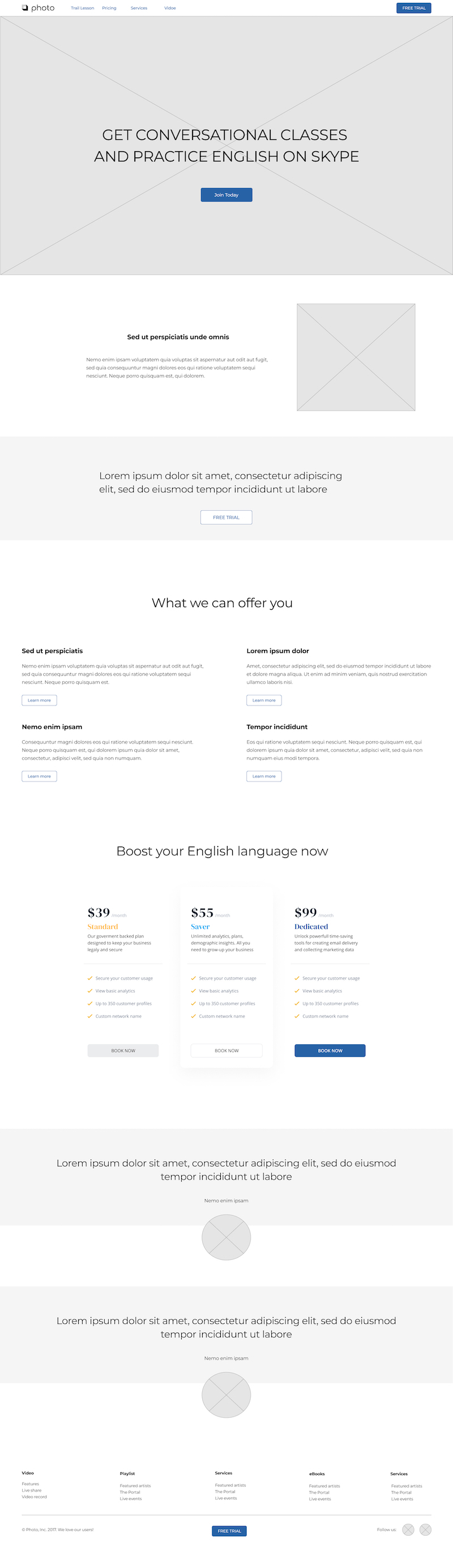
Wireframe:
Home page / in Figma
Validation (Testing)
No design project is complete without user validation.
There are three broad areas here:
User Testing before design
I wanted users to respond to my ideas, concepts and assumption of gaps.
User Testing during design
I wanted to test one of the alternatives chosen by user validation.
User Testing post design
I wanted to find users’ response to finished design; and those responses are intended to guide my refinements.
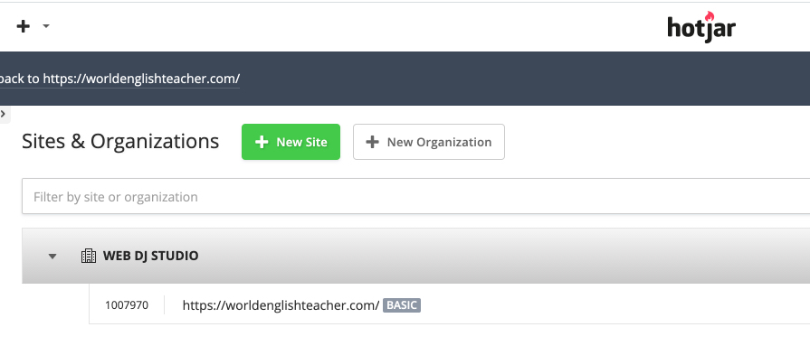
I used heat maps on Hotjar platform to see where users click, move, and scroll on the site. I learned how users really behave.
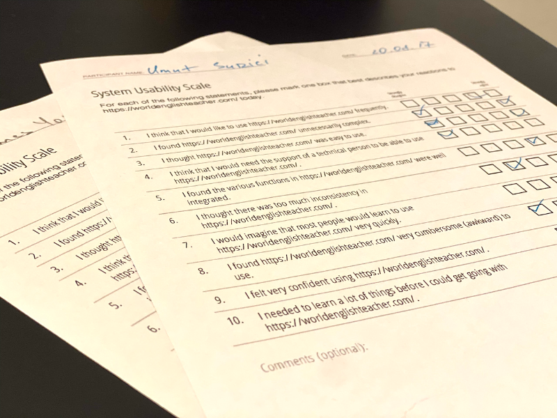
Besides testing on Hotjar I recommended testing in person because I could read body language and subtle signals like tension and sighs, or catch things such as people making faces because they are struggling. This was an opportunity to step in and ask if they’re confused about something.
Design and Implementation
Before even starting the development process of a project, I put myself in the end-users shoes. I need to know the motivations and pain points that users have. I can see a website through a user’s eyes and anticipate the best ways to move through it.
Logo
The logo should be horizontal. Vertical logos don’t work well on the web. As a rule, the logo is located in the menu, and it should not take up much space on the screen.
Joel had his logo ready, and we agreed to use it as it was.
Color Palette
The importance of color design stems from the significance of color to the human mind. Color creates ideas, expresses messages, spark interest, and generates certain emotions.
Within the psychology of colors, warm colors show excitement, optimism, and creativity; cool colors symbolize peace, calmness, and harmony.
Joel helped me choose his main color, and I prepared a color palette according to his choice #2763A7.
Images
I do not use clipart photos. Business people shaking hands – these photos do not work. I suggested my client take a picture of himself and his students. I searched for photos of the main targeted cities.
Font
Font affects communication. Now everything is based on content.
Every font has a character, so I found a font that matches the content.
As a rule, one font is enough for a website.
For contrast, I used a font pair: Raleway & Lato.
Raleway is an elegant sans-serif typeface family. And I use it for headlines.
Lato is a sans serif typeface family. The semi-rounded details of the letters give Lato a feeling of warmth, while the strong structure provides stability and seriousness.
The general style and neatness
I made sure the site looks nice and tidy:
– aligned indents,
– made headings consistent,
– made sure that the font size in the text is the same everywhere,
– made sure there is enough “air” on the site.
Content Strategy and UX
CS is technically not a part of UX, but it directly impacts the end content product. And yes, they are both required for the effective execution of creating, delivering, and managing content.
I suggested the scheme for copywriting:
– to write a short text about yourself. It should be one phrase that clearly and succinctly articulates what he is doing;
– to write a little more detailed text as if he was telling it to a friend over a cup of coffee in the most understandable language;
– to highlight three main features – why students love your classes;
– to describe the benefits telling us how your approach solves the client’s problem in detail.
I suggested preparing transcripts for all video files to be published on the site.
I suggested designing and publishing eBooks as additional practice for the students.
There are many SEO benefits for providing the best possible user experience.
We need an easily navigable, clearly searchable site with relevant internal linking and related content. All the stuff that keeps visitors on your webpage and hungry to explore further.
Sometimes identifying an SEO obstacle can lead to creative problem solving that makes a site even better than its initial design.
As a UX designer, I rely on wireframes, interactions, and storytelling to convey an experience catered towards the user. Meanwhile, as an SEO expert, I rely on search data directly from users to inform that same experience. SEO has the data that UX needs. UX has the web design framework that SEO needs.
Knowing it, we need to think beyond the keyword to understand what consumers truly want to consume. It is when SEO evolves from tweaking metatags to enhancing our brand’s digital ecosystem.
From the UX designer’s perspective developing site architecture, I explained how the proposed design limited our ability to optimize for some long-tail but highly relevant topics. In the end, we were able to modify the site architecture and templates to accommodate this additional level of content, a concept that we applied throughout the site.
Measuring and Iteration
At launch, this process is roughly 25% complete.
The real work (and value) comes in after launch in measuring the performance of the design and iterating.
Seeing how easy or difficult it is for a user to navigate through the content gave us a wealth of information about how effective the design is and any edits or changes that need to happen.
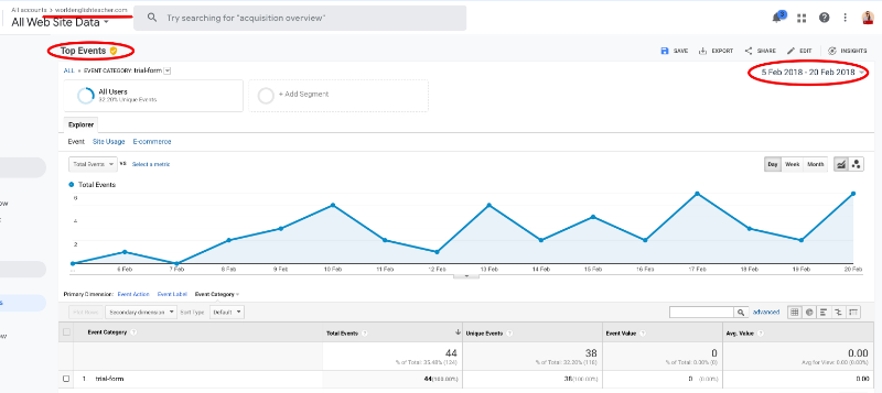
Event Tracking
Google Analytics defines events as user interactions with site content that can be measured independently from a web page or a screen load. Event tracking came in handy when I measured the success of a class booking completion during the first 15 days after the launch. It’s also good for monitoring video plays, ad clicks, flash elements, and downloadable eBooks.
Why First Input Delay is a good metric to improve
First Input Delay is one of the most exciting web performance metrics as it is purely a Real User Metric.
FID is all about the experience of a user that enters our page.
For that reason alone, it’s a great metric to monitor and optimize if it is necessary as it defines the website’s User Experience.
First Input Delay is one of the Core Web Vitals initiatives that track a website’s responsiveness.
Google wants to make Core Web Vitals a part of its ranking algorithm soon when the Page Experience update goes live.
In simple words, FID is the delay between when you click or tap on something like a link or a button and the time that the browser responds to your action and starts processing it.
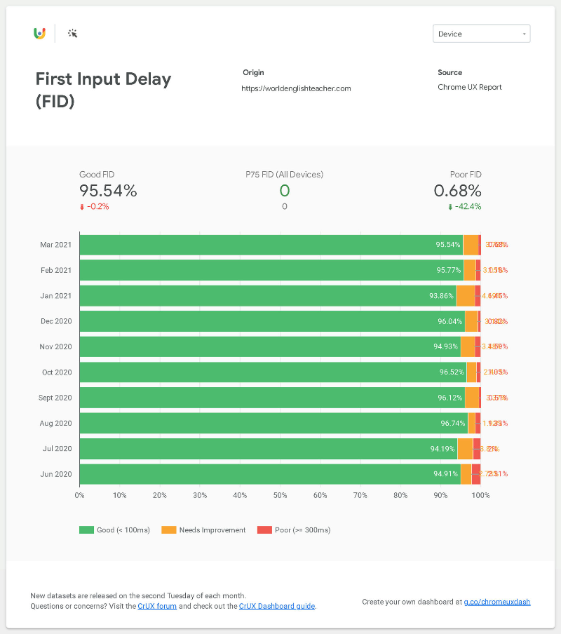
What’s a good FID score?
Studies show that delay of 100ms is perceived as being caused by an associated source. 0.1 second is about the limit for having the user feel that the system is reacting instantaneously.
For these reasons, it’s good to keep our FID under 100ms.
Please see the test stated below.
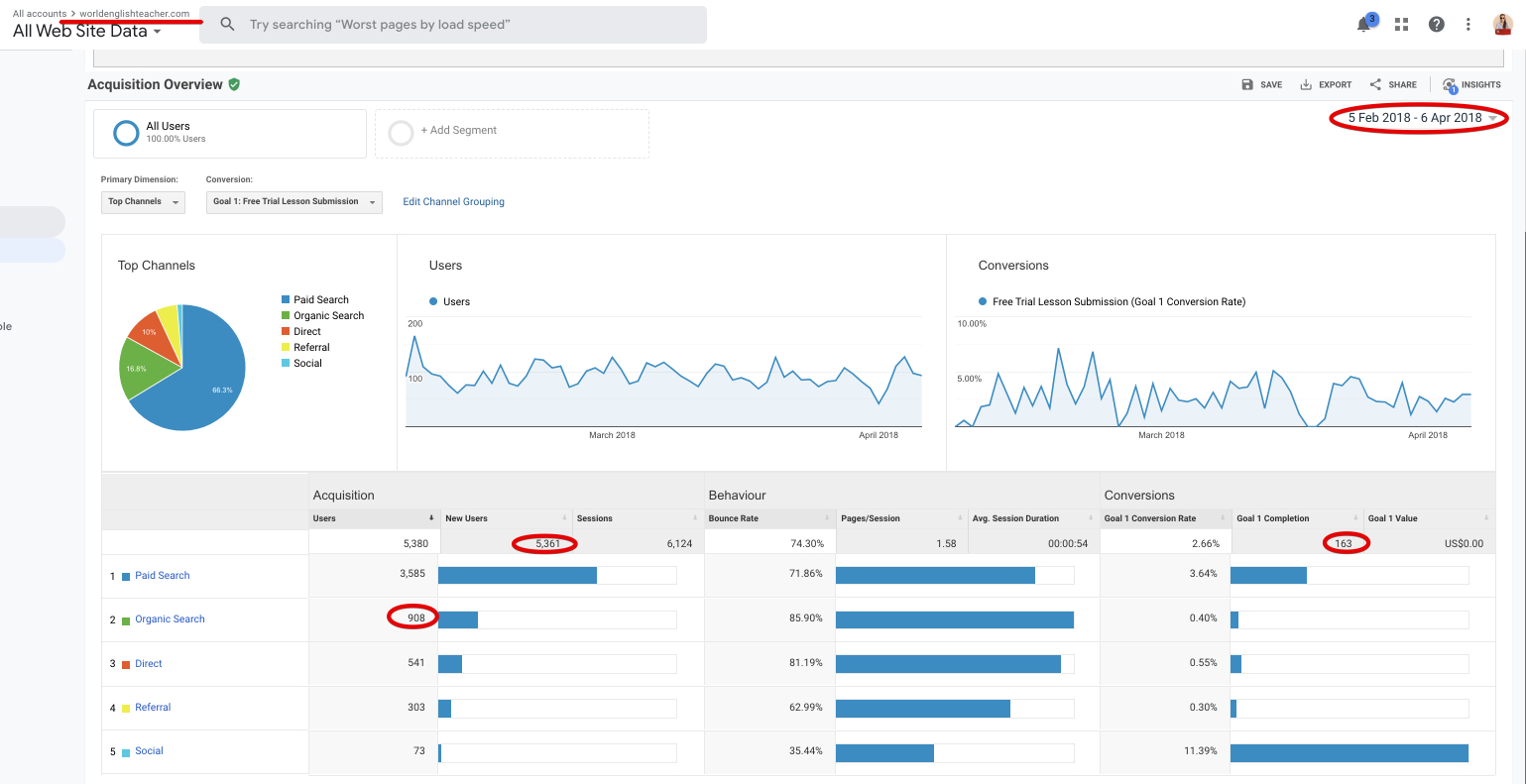
Analytics Review
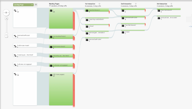
There are many different ways to approach an analytical review. I extracted behavioral flow data from Google Analytics one month after the site launch in this particular example. I used it to identify prominent user paths, high-impact pages, potential usability issues, and more.
Behavioral Flow
Behavior flow report shows me a user’s journey from the moment they land on a website right up to when they exit.
I can identify pages that deliver the highest volume of traffic and which paths they commonly take.
This report is useful in helping you choose specific pages and looking at the next few pages that people go to.
I had answers the following questions:
- Which pages did the customers visit?
- Which CTAs drew their attention?
- What was the landing page they entered through?
- Were there any repeat visits by the same users?
- Which page received the most attention?
By thoroughly analyzing the behavior flow, I can optimize a user’s journey to produce logical, meaningful, and easy steps to encourage them towards conversions.
When SEO and UX share their knowledge and goals, the result is a usable site that also performs.
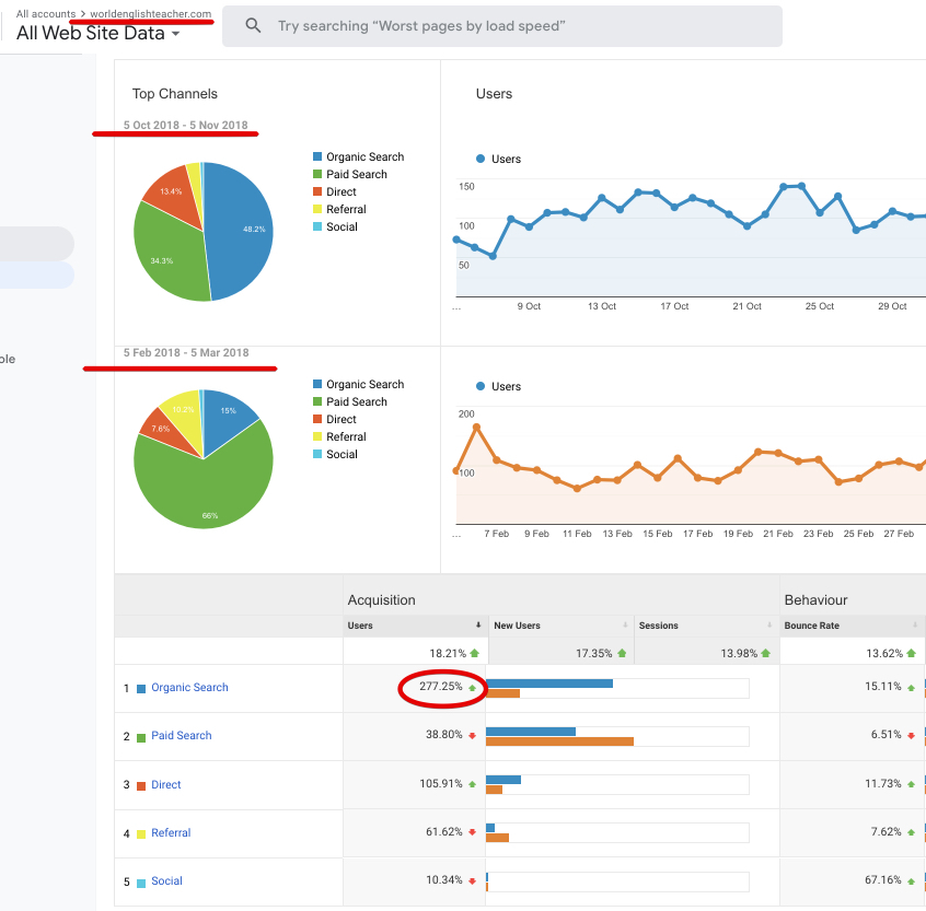
I compared results of one month during different periods:
- One month after the launch
- Eight months after the launch
I got a 277.25% organic search increase
New users increased by 17.35%
Sessions increase by 13.98%
The bounce rate decreased by 13.62%
Achievements
With credible UX success measurements, we can quantify our success.
Moreover, we can align our efforts to business objectives and desired outcomes.
Besides the achievements stated above, there is a list of the desired outcomes:
- Healthy & steady traffic growth since launch (over 5361 new users in the first two months);
- Referrals and social sharing validated content quality, trust, and credibility;
- 163 goal completions on business leads;
- 908 users from organic search.
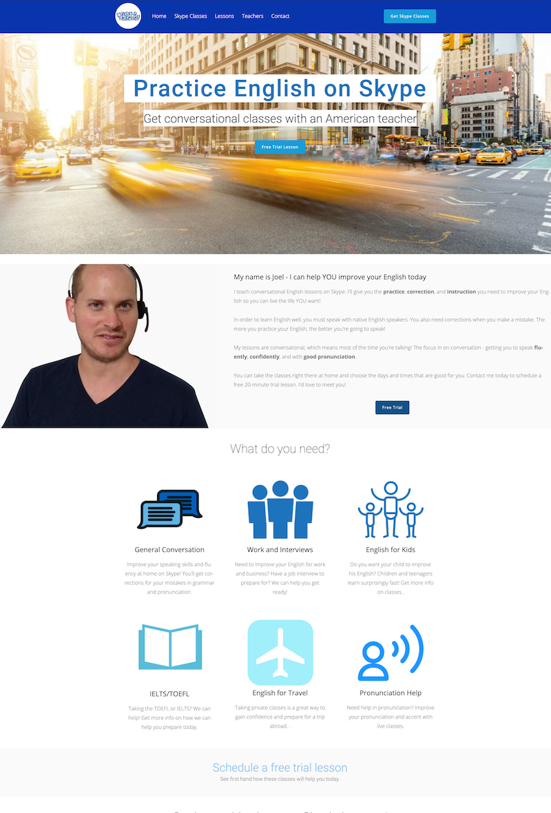
BEFORE
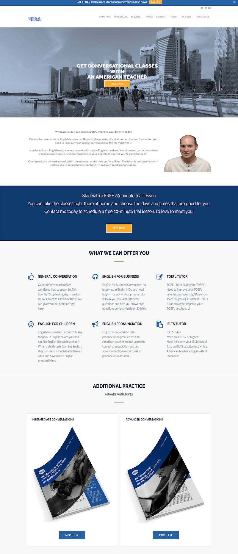
AFTER
Lesson & Takeaway
The main challenge and lesson learned:
I learned that active communication with my client and early-stage testing were keys to ensuring the project’s success.
The Takeaway:
This project validated my hypothesis that the most effective value proposition is centered around a person’s core motivation.
We need to keep users at the center of the UX process.
It’s easy to get caught up in the latest trends and fads the pop in and out of web design. But rather than try and have the hippest and coolest of web designs, it’s better to create something that never falls out of touch with what end-users want.
The main takeaway is to ensure that users are given what’s required – having a positive and fulfilling experience.


