


How user-centric approach emboldens wealth management
Crafting engaging and thoughtful digital pages that capture the world’s wealthiest seniors’ attention.
The main challenge
Ultra high-net-worth individuals is a highly specialized area of marketing. When putting together a digital channel designed to influence the decisions of some of the world’s wealthiest individuals, I need an out-of-the-ordinary approach. I need to craft engaging and thoughtful digital pages that capture the world’s wealthiest seniors’ attention.
Problem
Many wealth owners and those charged to care for the family wealth have found the responsibility to be overwhelming and their life quality substantially reduced and disrupted.
Some clients, especially the institutional and family offices, are looking for an advisor who helps define solutions based on technical algorithms and our ability to understand the experiences in terms of regulatory compliance daily and support them with solutions.
Objective
To extend assistance to relieve them from the emotional and physical burden of managing their wealth. To decipher the technical jargon thrown at them by numerous service providers and presenting it to them in a language clients easily understand.
Idea
Stakeholders had brainstormed some ideas on how the new site and a cartoon video will give a brief background on investing and show how they provide service for a prospective client looking for a financial advisor/wealth manager. Investors would get a good idea of methods and investment philosophy and get in touch with Al Wealth Partners.
What I did:
- Stakeholder interviews
- Building personas
- UX research
- Competitive research
- Creating wireframes
- Design
- Usability testing
- Measuring and Iteration
- Graphic design
- Photo editing
- Site launch
- Post-launch testing
- Google Analytics set-up
- Google Search Console integration, etc.
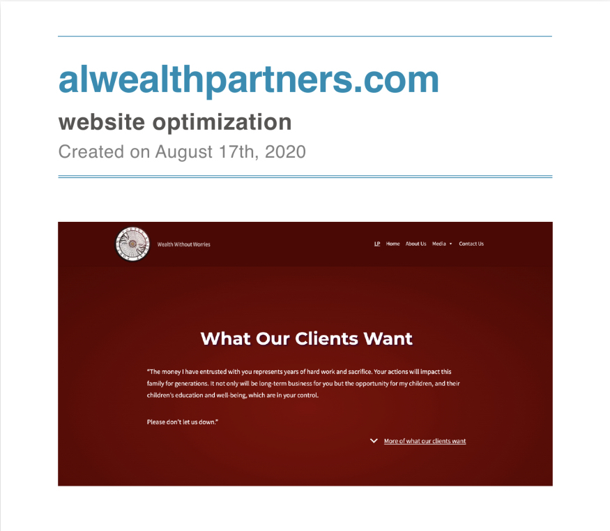
- Website optimization
Establishing Key Audiences & Building Personas
Who are they?
Individuals and families who are either current or retired business owners tend to have investible capital of $10MM or more.
Age: 60+
Gender: Mixed
Family: Single & Married
Hobbies: golf, sailing, art collecting, owning horses, philanthropy, etc.
Here are some more facts, mostly from The Wealth-X and UBS World Ultra Wealth Report, which compiles and analyzes information about UHNW investors:
- 87% are male.
- 91% are married.
- 4% are divorced.
- 3% are single.
- 2% are widowed.
How do they find information?
Based on the PwC report “HNWIs and Digital,” 85% of HNWIs use more than three digital devices, and 98% access the internet/apps daily.
UHNW individuals tend to stick together. They live in each other’s communities, vacation in similar venues, and attend the same social events.
What is marketing collateral pivotal?
Blog posts, emails, content, trustable media, valuable information that demonstrate your care for and expertise in your market.
What do your users want?
HNWIs want to build a legacy, donate to charity and leave a nest egg for their kids.
Their needs include estate and tax planning, wealth management advice, and family governance advice. There’s also philanthropic planning.
Solution
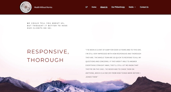
Stakeholders recommended building a website from the client’s perspective. I needed to highlight the following points (‘why our clients come to us,’ ‘what our clients tell us,’ or ‘what our clients want’) and feature them prominently on the first landing page.
Based on our interview results, I suggested possible solutions:
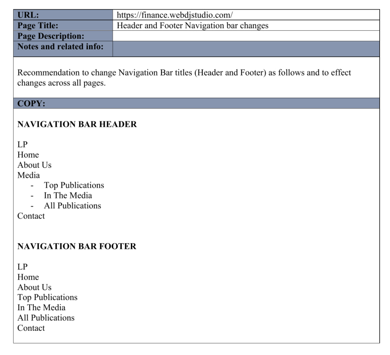
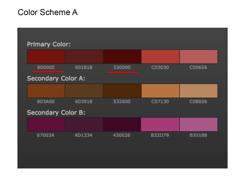
- Interactive website design on the WordPress platform;
- UX improvements;
- Publishing video as a lead;
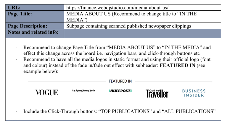
- ALWP in the media;
- All publications of stakeholders;
- Philanthropy, etc.
As an accessibility practitioner and researcher, I incorporated usability techniques to improve ‘usable accessibility’ and, in the end, to make the design work better for more people in more situations. Addressing accessibility, usability, and inclusion together can effectively lead to a more accessible, usable, and inclusive web for everyone.
UX Competitor Analysis
Competitors: essentially the private banks or other money managers.
From the stakeholder’s perspective, their sites look similar and don’t really stand out to potential clients looking at them.
group.pictet
credit-suisse.com
juliusbaer.com
Wealth Managers:
cornerstoneway.com
hpwm.sg
crossinvest.com.sg
crossbridgecapital.com
tauruswealth.com.sg
I analyzed competitors:
– to see the top pages on competitors’ websites;
– to reveal your rivals’ top web pages;
– to spot new landing pages that competitors promote;
– to see your competitors’ most popular products, services, and categories.
Aside from that, however, there are some other important reasons:
- To solve usability problems,
- To understand where the service stands in the market,
- To know the strengths and weaknesses of the competition,
- To focus efforts on a target audience.
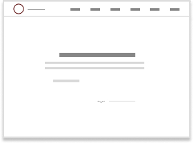
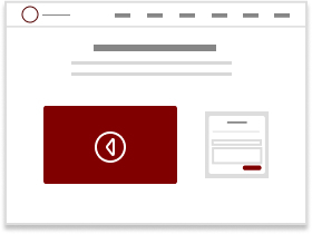
Sketching & Prototyping
Inaccessible design choices irritate users of all ages.
Interactive elements such as buttons, dropdowns, and links displayed at a big size are easy for older users to click on or tap. Readability challenges on mobile devices were significant. Interface text on mobile apps was often too small and lightly colored for seniors to read comfortably.
Inflexible and Unforgiving Interfaces
Interfaces in websites and apps are often inflexible and unforgiving of errors. Many sites and apps accepted user inputs in only one form, and seniors were frustrated by this narrow range of interaction.
Further, seniors often had problems reading error messages, either because the wording was obscure or imprecise, or the message’s placement on the screen was easily overlooked among a profusion of other design elements.
Validation (Testing)
User testing in the design process’s prototyping stage allowed me to grasp better the target user group(s) — all the more important when our users have a visual or mobility disability or hearing impairment.
I explained the importance of affordances and feedback when designing for aged users. Giving feedback is important for any user. It is imperative when designing for users who need things to be explicit or who cannot interact traditionally with an app.
We tested a prior moke up of the site, got feedback, and I was happy to make corrections according to the collected test results.
Design and Implementation
I needed to design by embracing both accessible design and an inclusive content strategy.
I need to keep in mind physical issues.
The hand-eye coordination will slow down, motor skills tend to decline, and arthritis in fingers can greatly complicate the interaction with mobile applications. With that being said, I have to consider how older people will interact with your app or website.
I need
- to provide a clear structure of the website;
- to avoid abbreviations or acronyms;
- to pair icons and symbols with text;
- to keep the scrolling simple and avoid displacement wherever possible;
- to increase the size of buttons and distances on the website;
- to make the purpose of the page clear.
Content Strategy
Content written for and by older people is difficult to find — when this content is available, it often treats seniors as a niche interest group rather than a diverse and growing demographic.
Because Stakeholders frequently speak at investment and banking forums, give interviews to Media, I suggested publishing all content where the company and stakeholders are featured in.
According to the Stakeholders’ desired keywords and my analysis in terms of Google search results, I recommended writing the site title, tagline, and meta description.
Measuring and Iteration
Performance is a foundational aspect of good user experiences.
Mobile devices have limited processing power and memory. They often get overwhelmed with what we might consider a small amount of unoptimized code. This creates poor performance, which leads to unresponsiveness.
Performance plays a major role in the success of any online venture. High-performing sites engage and retain users better than low-performing ones.
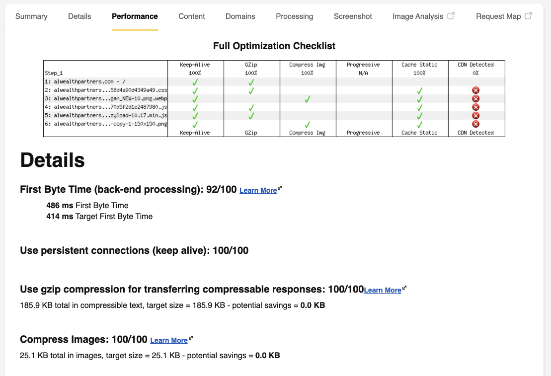
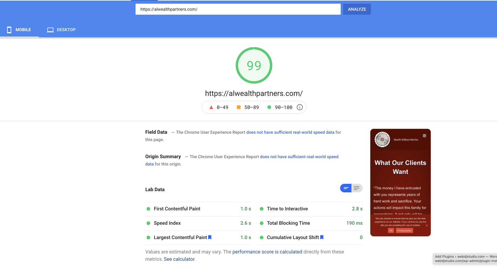
All the work done above gave its results.
Please see the data on screenshots stated below.
(Two months after the site launch)
Average position – 12.8
Average CTR – 29.3%
Organic Users – 224
The bounce rate is low – 34.80%
Lesson & Takeaway
The main challenge and lesson learned:
Designing with accessibility in mind means being inclusive of everyone, whether they have a permanent disability or experience situational and temporary disabilities from time to time. Accessibility is in no way, shape, or form an edge case — it impacts 100% of our users.
According to the WHO, even when you limit your definitions of disability to permanent disabilities only, 1 out of 7 people is disabled. That is more than one billion people in the world.
However, disability is much wider than that. It could be situational deafness or temporary motor impairment. Everyone experiences situational and temporary disabilities daily.
The Takeaway:
The success of a project depends on more than utility and usability alone. Web applications which are usable, useful, findable, accessible, credible, valuable, and desirable are much more likely to succeed. And it is true for people with differing abilities, for people from different cultural backgrounds, income levels, age, gender, belief, etc.


